Views, filters and search
Every list of cards (All cards, My cards, a type, or a type inside a space) can be shown five ways. Pick the one that fits the job: a table to compare properties, a feed to read, a matrix to check links, a grid to browse. Your choice is remembered for each list in your browser.
Switch the view
Section titled “Switch the view”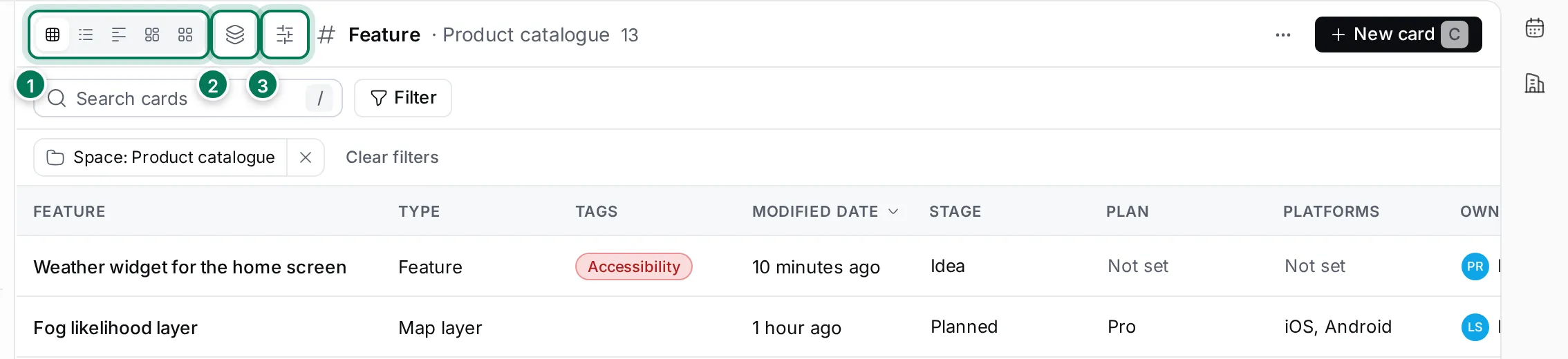
- The view switcher: Table, List, Feed, Traceability Matrix and Grid.
- View options sets grouping and ordering in the list, and Show all versions in the table, matrix and grid.
- Configure columns chooses what each row or tile shows.
The search field below finds cards by title. Press / to jump to it.
The table is the default. Each column is a property; click a header to sort by it. Click a value such as Stage or Owner to change it right in the table, or click elsewhere on the row to open the card. Use ↑ and ↓ to move between rows and Enter to open one.
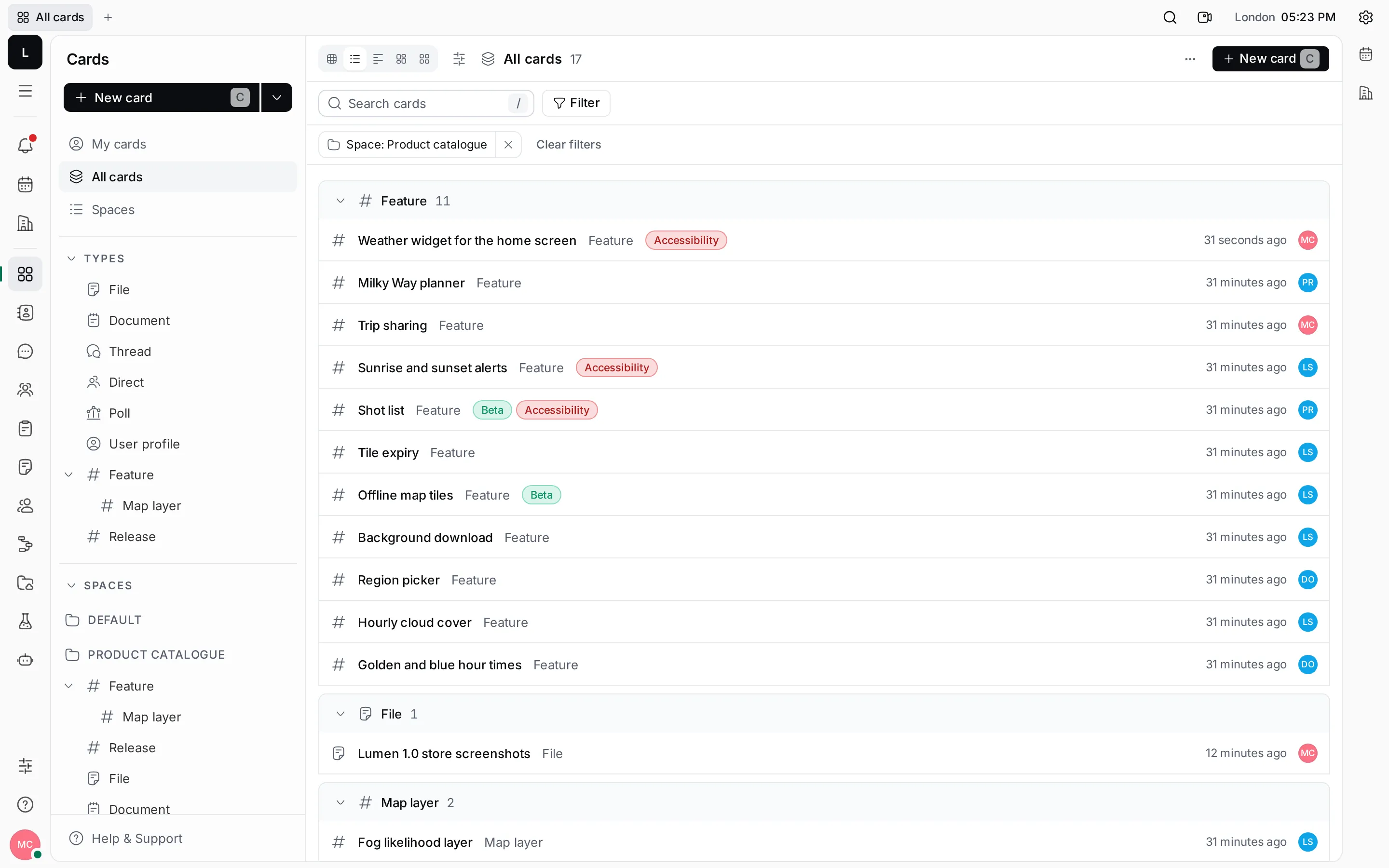
The list groups cards, by type to start with. In View options you can group by Type, Created by, Modified by or Parent, or not at all, and order by Modified date, Created date, Title or Manual. Click a group’s header to fold it.
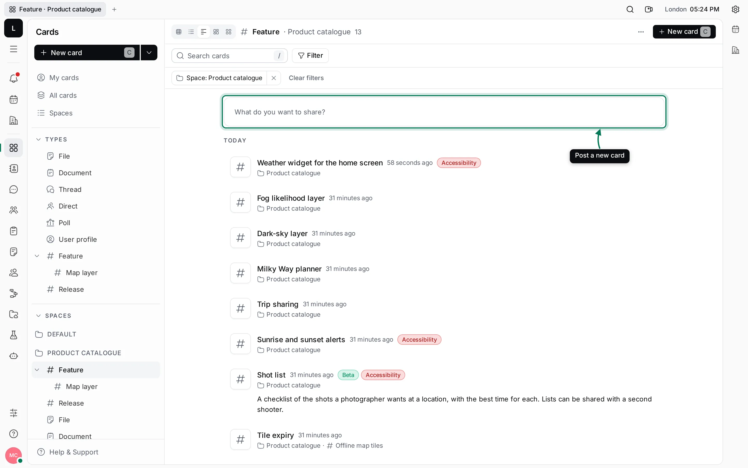
The feed shows cards as posts, newest first, grouped by day and month, with their content. It’s a good way to read what the team has added lately.
To post a new card from the feed, click What do you want to share?, write the text, check the space and type, and click Post. The title starts as the first line of your text.
Traceability Matrix
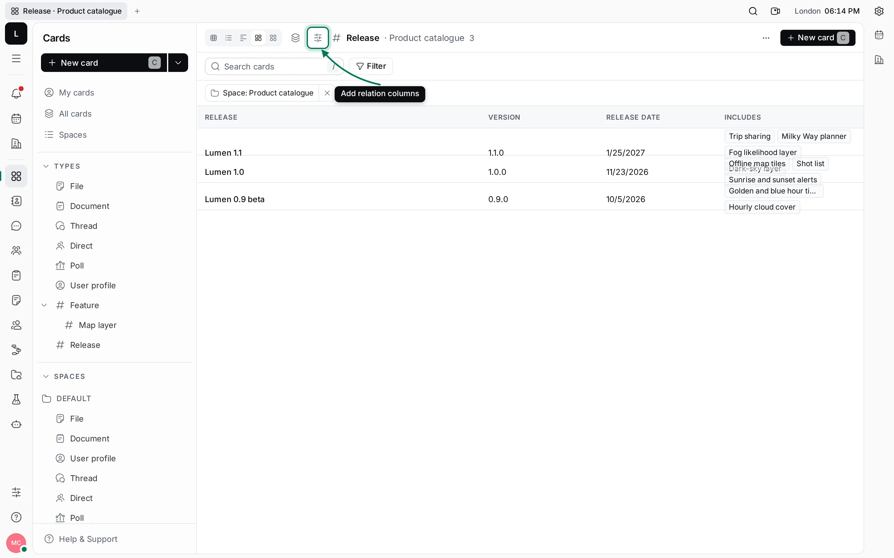
Section titled “Traceability Matrix”The matrix starts with just the card column. Open Configure columns and add a relation, such as Includes on releases, to see in each row which cards are linked. Add properties as columns too.
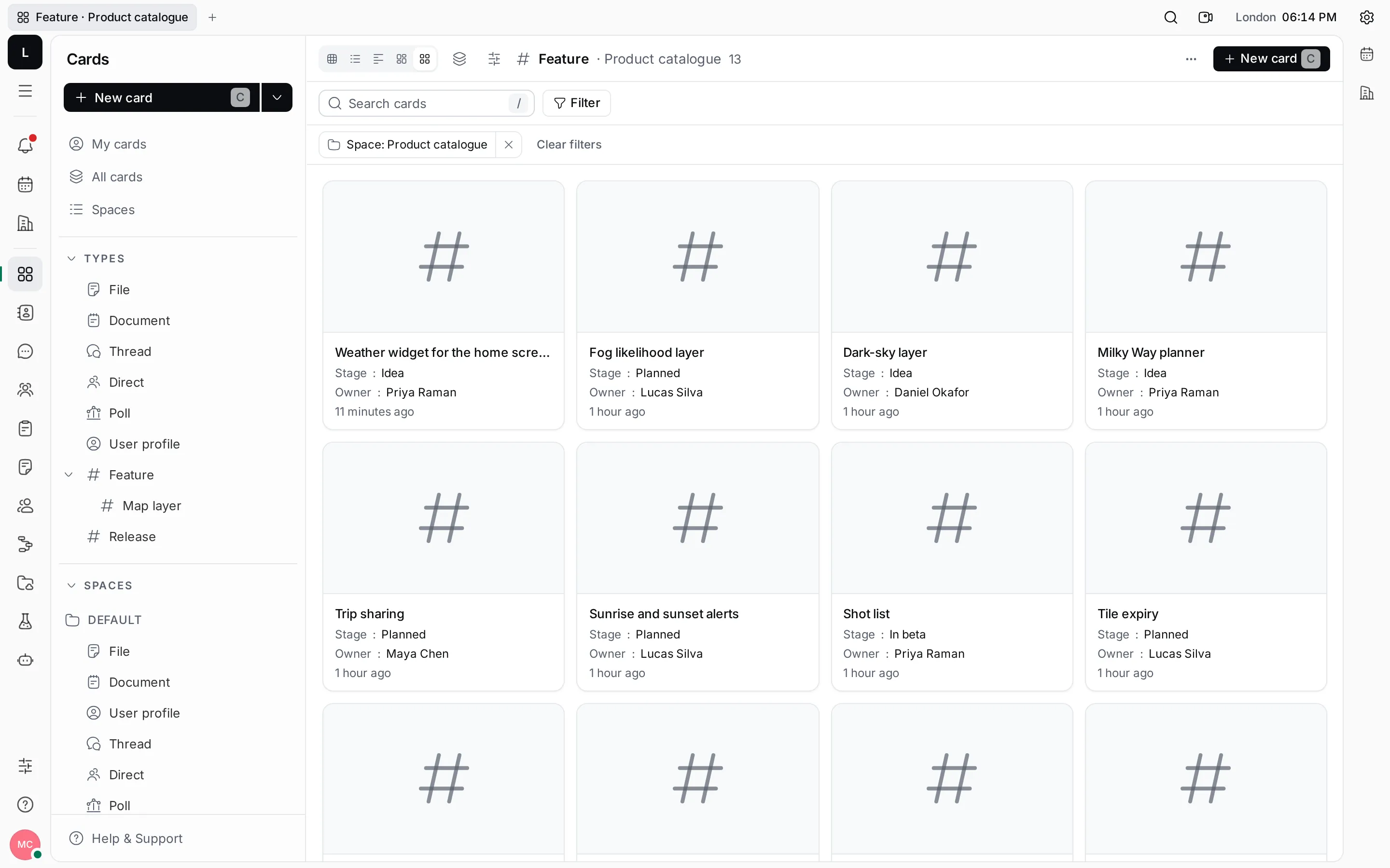
The grid shows each card as a tile with a large preview, its title and the time it last changed. Cards with an image show it as the preview; the others show their type’s icon. Turn on properties in Configure columns to show them on the tiles. Use the arrow keys to move between tiles.
View options and columns
Section titled “View options and columns”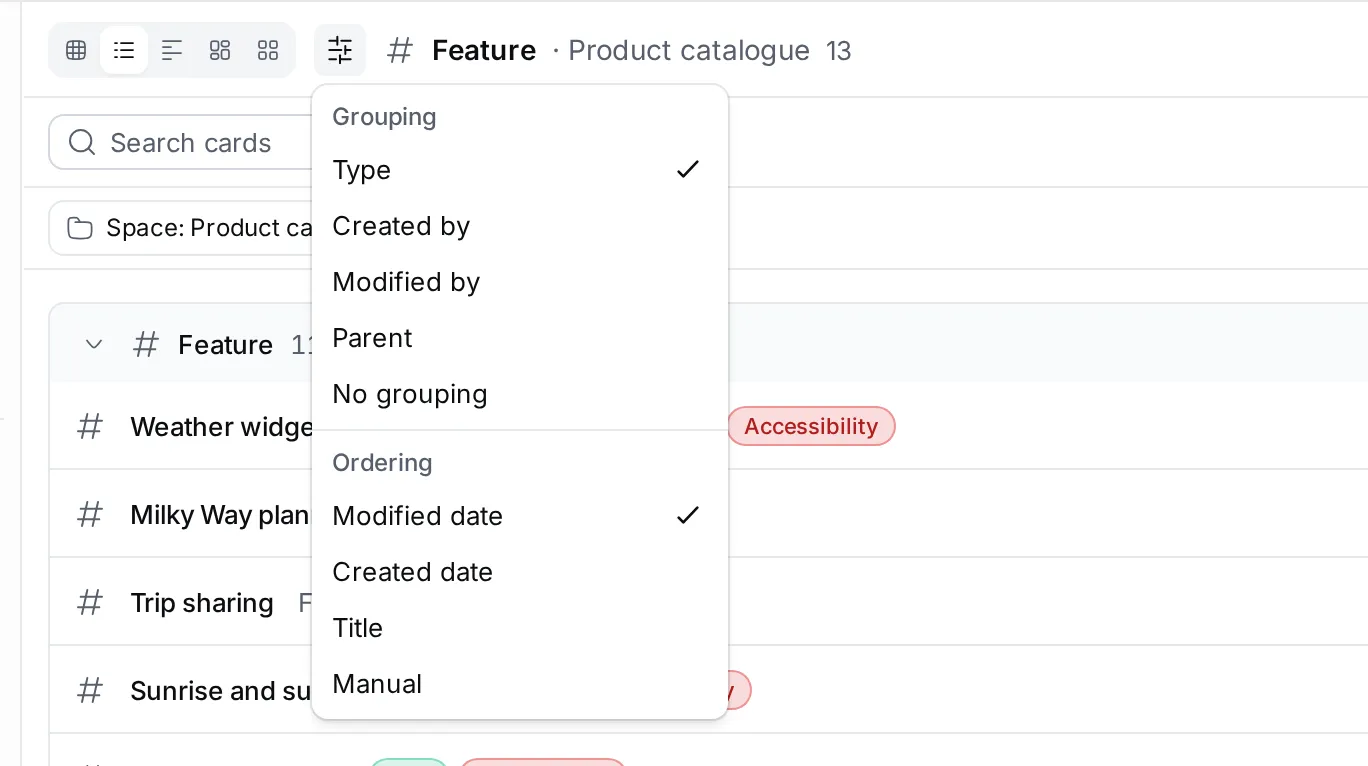
- Configure columns lists the standard columns (Type, Tags, Space, dates and people), the type’s properties, the properties of its tags and, on a type, its relations. Restore defaults goes back to the standard set.
- Show all versions in View options also lists older versions of cards whose type keeps versions.
- ⋯ › Copy All copies the visible rows and columns as a Markdown table, ready to paste into a document.
Filter and search
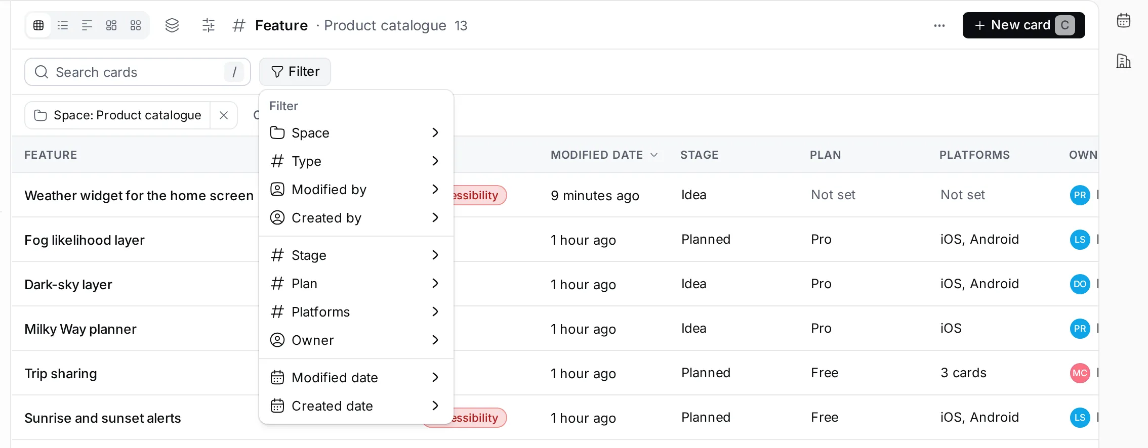
Section titled “Filter and search”- Click Filter.
- Pick what to filter by: Space, Type, Created by, Modified by, a date, or any property of the type.
- Pick one or more values. Text properties filter by “contains”, numbers by “equals”, dates by Today, This week, This month and similar.
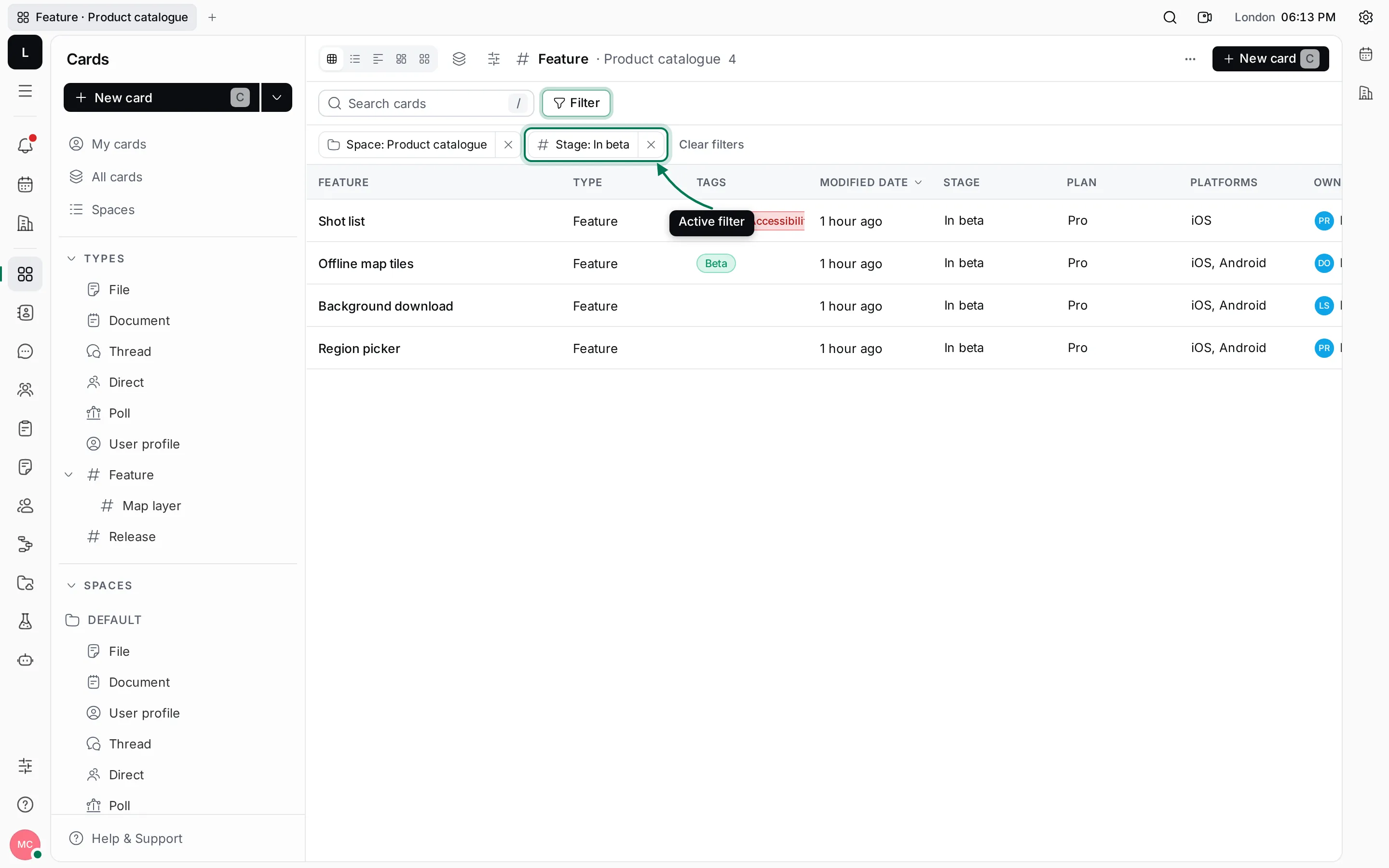
Each filter shows as a chip next to Filter. Click × on a chip to remove it, or Clear filters to remove all of them. Filters are part of the page’s address, so you can share a filtered list by copying the link.
Next, link cards to each other with relations, or set up a process that moves cards through their stages.